Neutral tones are anything but dull. When used skillfully in interior remodeling, neutrals can evoke sophistication, calmness, and beauty. In this article, DreamMaker Bath & Kitchen of Southern Rhode Island shows how neutral shades, textures and materials can enhance your home’s aesthetics.
Understanding the Spectrum of Neutrals
At the core of designing with neutrals is grasping the vast spectrum these tones offer. From taupes with pink undertones to a variety of off-whites, choosing the right shade can significantly impact a room’s ambiance. Designers emphasize the importance of considering the light exposure in a space when selecting neutrals, as these colors can significantly change in appearance throughout the day. This consideration ensures that the chosen palette enhances the room’s natural beauty at every hour.
Material Matters
The materials you choose in a neutral-themed renovation are crucial—they add depth and warmth to your space. For kitchens and bathrooms, which are often focal points in home remodels, selecting materials like quartzite for countertops or backsplashes can introduce subtle color variations and add a vibrant touch. Wood finishes, such as bleached walnut or cerused oak for cabinetry, paired with off-white walls create a soothing environment that’s both inviting and stylish.
When searching for a contractor near me for your upcoming project, ensure they understand the importance of material selection in achieving a serene and welcoming neutral space.
Adding Depth With Mixed Finishes
One way to prevent neutrals from falling flat is to incorporate mixed finishes into your design. An interior remodeling project that utilizes a variety of paint finishes, from high-gloss to matte, can create depth and visual interest. This approach allows light to interact dynamically with the colors and surfaces in a room, enhancing the overall effect of the neutral tones.
Creative Contrasts and Layering
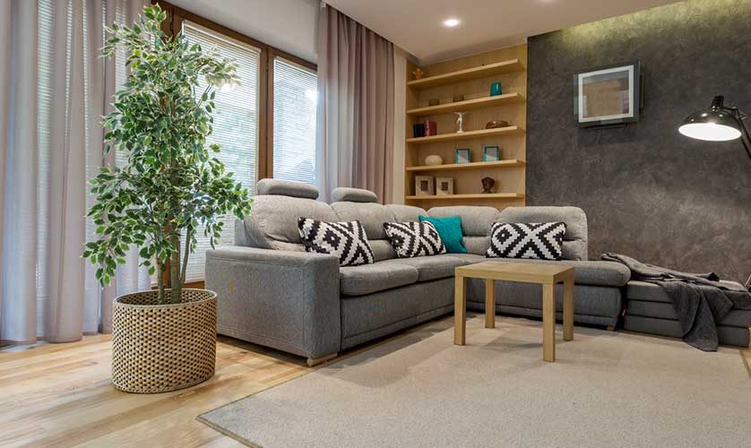
The key to captivating neutral design is layering tones and textures. Contrasts, such as dark elements or metallic accents, add depth and prevent monotony. Introducing luxurious natural materials and thoughtful furniture placement further enhances the neutral palette.
For example, when seeking a kitchen quote, consider asking for design options that explore the use of contrasting materials. Alternatively, you can opt to include an accent piece in a bolder color.
The Power of Texture
Texture is vital in a neutral-themed design. Using fabrics like boucle and linen adds depth and character, enhancing the subdued color palette. The tactile contrast between materials creates interest, making the space engaging and comfortable.
Let’s Start a Conversation!
Discover the beauty of neutrals with DreamMaker Bath & Kitchen of Southern Rhode Island. Whether you’re planning a full-scale interior remodel or a simple kitchen refresh, our design experts can transform your space with warmth and sophistication. Call (401) 399-3917 or complete our contact form to schedule a consultation. We serve homeowners in Hope Valley, Hopkinton, Jamestown, Kenyon, Newport, North Kingstown and neighboring communities.


