For some people, having every paint color available for their choice means having a limitless selection of paint options for their interior color palette. Others, however, may find the number of options overwhelming. If you’re among the latter, read on as home renovation company DreamMaker Bath & Kitchen of Northwest Arkansas shares tips and tricks on choosing your interior paint colors.
Choose Colors for the Common Rooms First
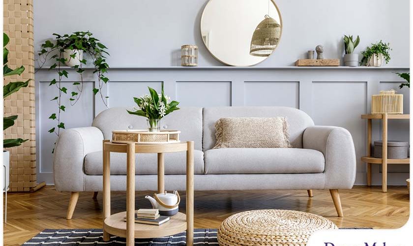
Common rooms or formal areas include the entryway, living room, and dining room. Since these areas are shared with the other members of the household, think of them as the thread that connects all the rooms in your home. Choose a color scheme for these areas first, then choose one or two colors as the basis for the rest of the house.
Follow the “60-30-10 Rule”
The “60-30-10 rule” pertains to choosing three colors for a color palette, consisting of a dominant color (60%), a secondary color (30%), and an accent color (10%). The ratio will help ensure balance while maintaining visual interest. A home remodel application of this is applying the dominant color on the walls, secondary color on the floor or ceiling, and accent color on the trim. Secondary and accent colors can also be applied to furniture and accessories.
Choose Lighter Colors as You Go Higher
You may have noticed how dark colors generally look great on roofs. Light-colored roofs make the house look top-heavy, especially if the building is two or more stories high. The reverse is true with the interiors. Human eyes are conditioned to see the sky as brighter than the ground. This is why dark colors work best on the floor, medium colors and neutrals on the walls, and light colors on the ceiling.
Be Inspired by Large Pieces In the Room
A large element in the room, be it patterned upholstery, a large painting, or a colorful rug, can be your inspiration when choosing the room’s color palette. Find a distinct color combination or pattern from one of these pieces and use it as a reference for the room’s color palette. This is ideal if your chosen piece is a permanent one or something that is not intended to be removed.
Use Striking Colors to Make Smaller Spaces Pop
Most people would choose white or pastels for small rooms because it can make the room look bigger, but you can give the room more visual impact with striking colors. Contrasting colors between adjacent walls can add depth.
Let’s Start a Conversation!
DreamMaker Bath & Kitchen of Northwest Arkansas offers a wide range of professional interior remodeling services. To get started with a no-obligation consultation, call us at (479) 315-5253, or contact us online! We serve homeowners in Sulphur Springs, Siloam Springs, Bella Vista, and the nearby communities.
